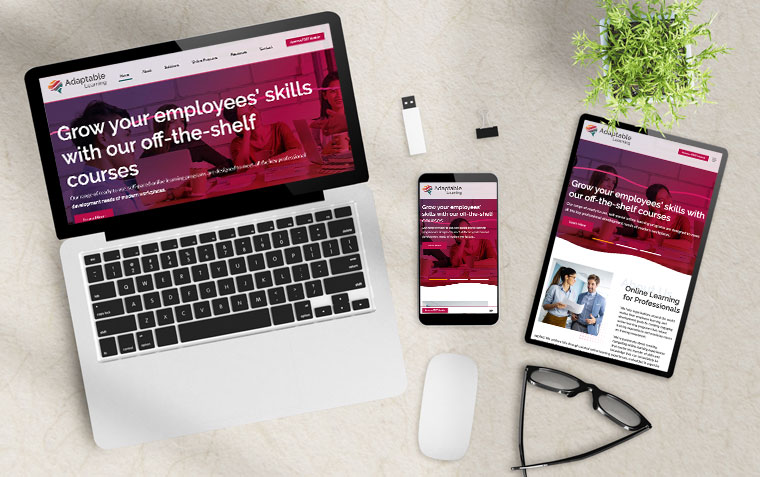
Responsive Design
WordPress Responsive Design – Engineered for Seamless User Experience Across All Devices
Today, over 60% of web traffic comes from mobile devices. Responsive design isn’t just a “nice-to-have”—it’s critical for user engagement, SEO performance, and your bottom line. I build WordPress websites that are fully responsive by design, not as an afterthought.
With extensive experience in precision industries and software development, I approach responsive design with the same principles: adaptability, efficiency, and clean execution. My workflow ensures that every site functions flawlessly across all major devices, browsers, and screen sizes, including:
-
Mobile-First Development: CSS media queries and flexible grids designed to prioritize mobile UX, then scale upward.
-
Optimized Breakpoints: Strategic breakpoint planning for smartphones, tablets, laptops, and widescreen displays.
-
Flexible Layouts and Components: Fluid containers, scalable typography, and image responsiveness (using
srcset,sizes, and lazy loading). -
Performance-Focused Design: Minimized DOM depth, asynchronous asset loading, and lightweight frameworks to ensure speed across all connections.
-
Touch-Friendly Interfaces: Buttons, navigation, and forms designed for tap interactions with accessibility best practices in mind.
-
Cross-Browser and Cross-Device Testing: Extensive QA processes to validate performance on real devices and multiple browser engines.
Responsive design isn’t just resizing—it’s about dynamic usability. I engineer WordPress experiences that feel natural, whether your visitors are browsing on a 6.1″ phone or a 34″ ultrawide monitor.
👉 [Let’s Discuss Your Project] – See how a true responsive strategy can elevate your WordPress site.
